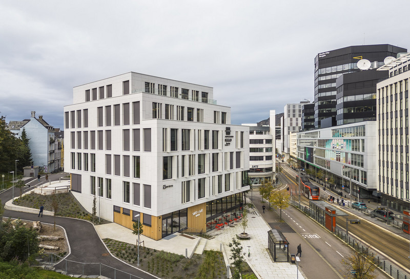
Aktiv property agency
Spatial branding
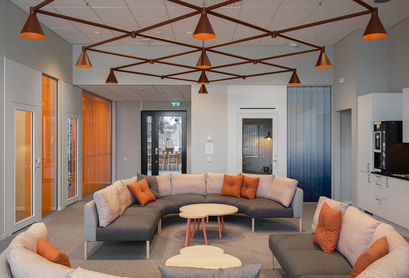
Elements from Aktiv’s updated branding strategy, graphic profile and the company’s core values of ‘active, professional and humble’ laid the foundation for the interior design which was awarded the label ‘Jovial Trendy’.
Spatial branding is essentially about understanding, interpreting and converting a company’s identity into a physical form. Through the strategic use of form, colour and materials with a playful and informal look, Aktiv wanted to appear as a credible operator who knows its local home market best.
The interior is cosy and homely and focus on small curious details, sculptural lighting, tactile warm surfaces and modern Nordic minimalism. Extensive use of wooden surfaces and the fresh ‘common thread’ as supporting elements are intended as a nod to Aktiv’s jovial image.

Spatial branding is essentially about understanding, interpreting and converting a company’s identity into a physical form.


The interior is cosy and homely and focus on small curious details, sculptural lighting, tactile warm surfaces and modern Nordic minimalism.


The design guide aim to inspire the 69 proerty agencys around Norway to use the same interior design and concept.


Read more
Want to know more about the project?